Deb
Services
Product Design (UX, UI, Interaction) + Front-End Development
Year
2017
My company, Made By Munsters, worked with Deb during the summer of 2017. Deb is a financial tech startup based around debt collections. The concept was to provide people with a way to negotiate and manage the debt they have in collections. As the lead on the project, I worked on developing the overall experience strategy for the application. In partnership with the founding team, I created a series of user flows and stories to determine the necessary features. I was also in charge of designing the wireframes, providing the general design direction, and ensuring the applications were built.
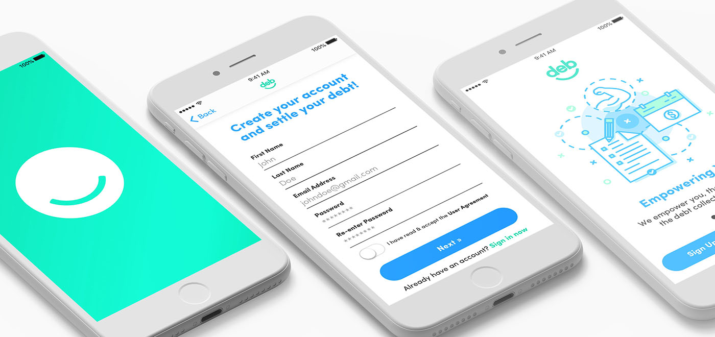
Consumer Mobile Application
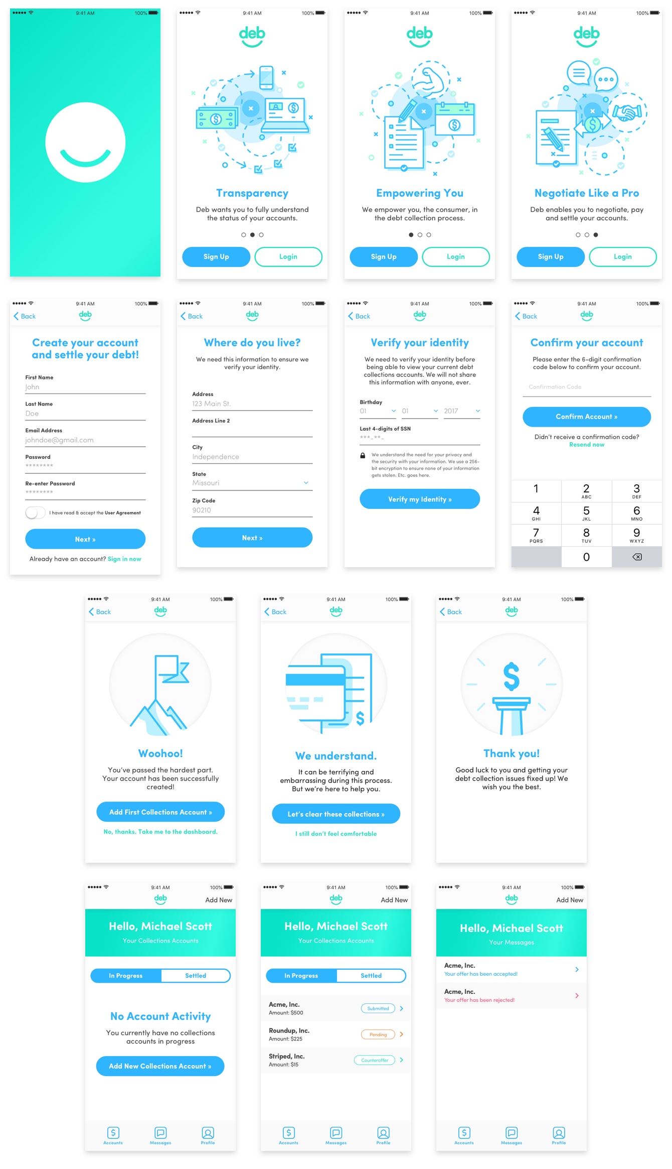
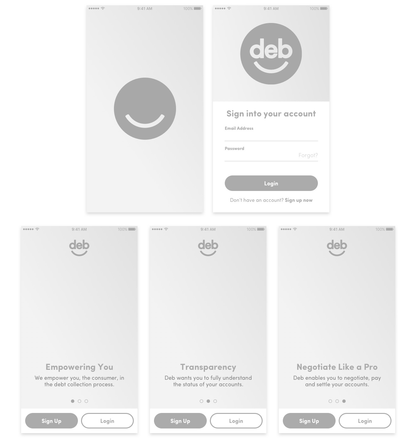
The first segment of Deb's product offering was the consumer application, specifically for mobile users. We wanted to make the onboarding process super simplistic as well as engaging through the use of custom illustrations. This step-by-step process would provide them with better context of what the product can do for them. Once they dive into the flow of signing up, users have to verify a few key pieces of information. They also have to opt into the application to ensure they can be contacted. Lastly, they needed a way to track, input, and settle their debt. As you can see below, the final product was brought to life through the use of wireframes.
Admin Platform
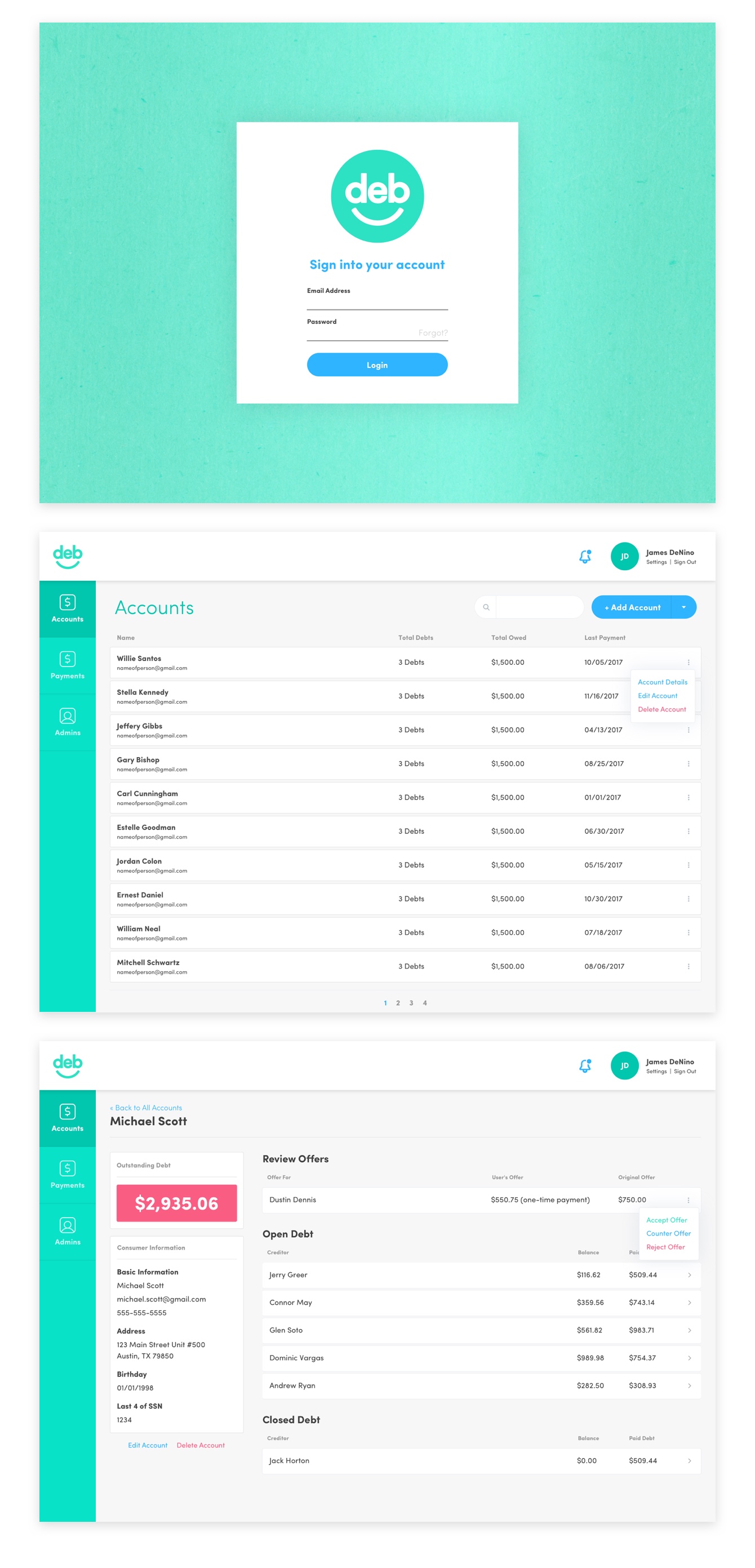
With any consumer application, the team at Deb needed a portal to manage the users, facilitate communication with them, and help them account for payments to settle their debts. This admin platform consisted of those key features, and after speaking with the users of the system, we opted to keep the design very simplistic. Because it featured a list of users for accounts, I wanted to provide a simple table-list view along with the ability to sort and search.
Marketing Website
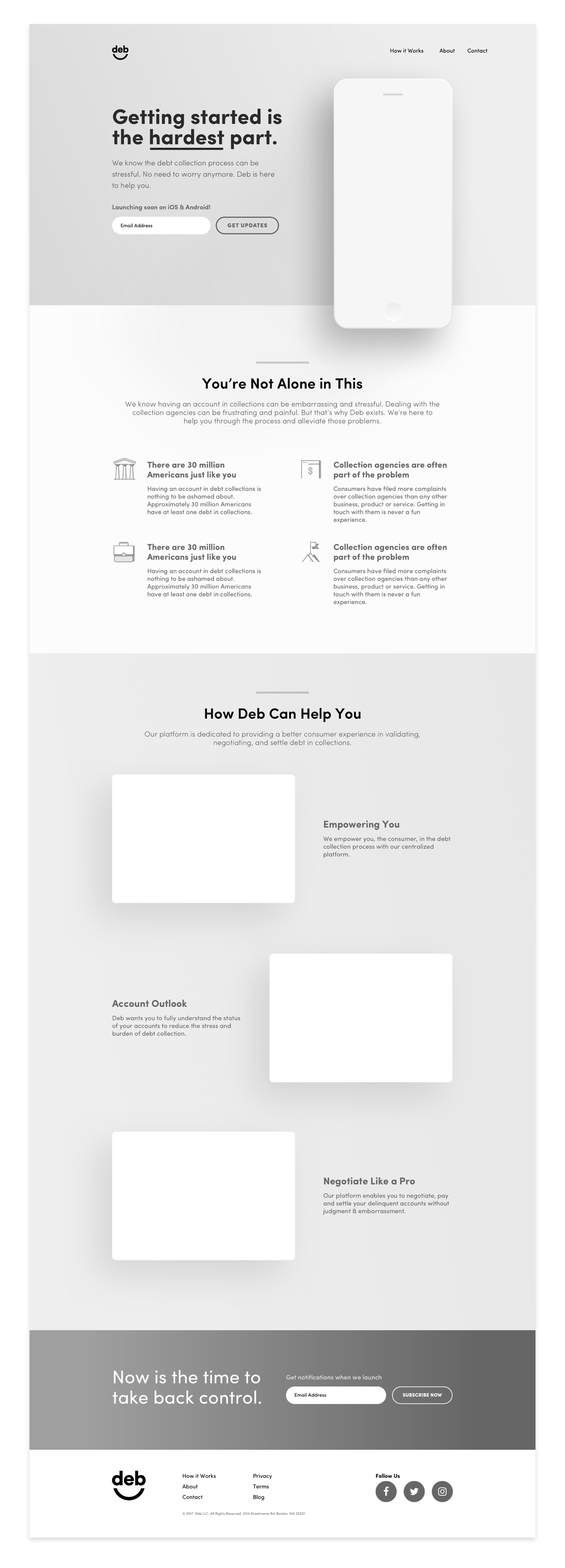
Before even beginning to design out the consumer mobile application and the admin portal, I worked to design a marketing website that would describe the services of Deb, and pitch people on why they should download the app, sign up for an account, and begin using the service. Since this was created, the company direction has taken a turn, and if you look at the live site, unfortunately, it no longer looks much like what I created.
Conclusion
While our team completed the branding, UX strategy, and visual design components, we did not complete the final build of the product. Unfortunately, we handed our designs over to another team, and most of the work we had completed has not yet seen the light of day.