Datasplash
Services
Product Design (UX, UI, Interaction) + Front-End Development
Year
2017 - 2018
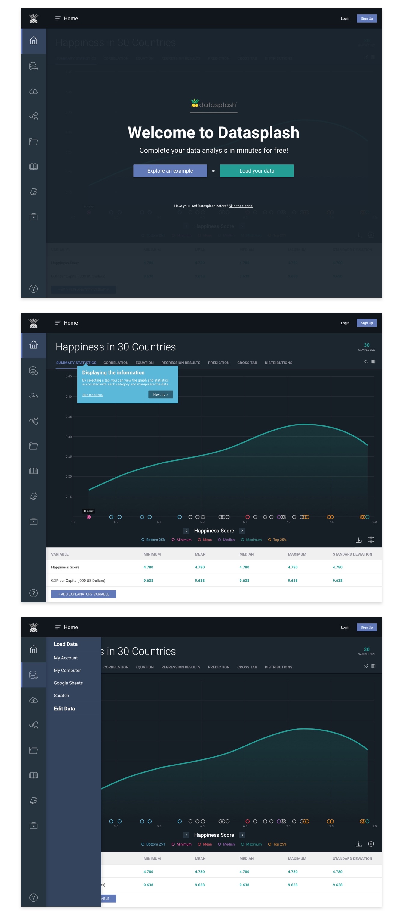
Datasplash is a web-based application that enables users to visualize and explore complex datasets. The team at Datasplash had approached Made By Munsters to revamp its existing platform. Originally it had been built using Bootstrap, and had the typical look of a cheap interface. They wanted to enhance the overall usability of the product while strengthening the visual design. When they came to us, our primary business goal was to make "data pretty and easy to use".

User Research
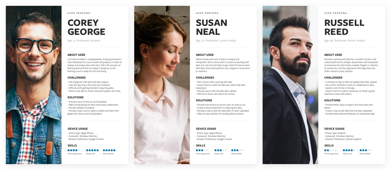
I conducted some research with some of their existing users (primarily college students taking statistics) to really dig in deeper to find out what wasn't working with the existing application. The primary problem was navigating to the proper areas to upload or create their datasets as well as the overall complexity and flexibility of what the app has to offer. Below depicts the three different user roles determined from the research conducted:

Customization
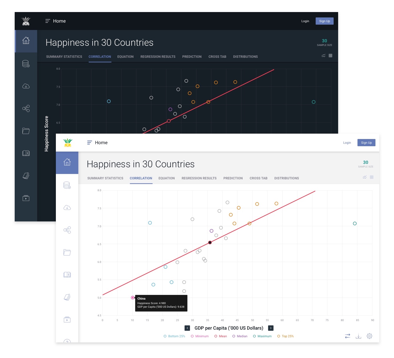
One other key component requested from users was the ability to switch the dashboard view between a light and dark inteface. The reasoning for this: A) users like to manipulate data using the dark mode because it's easier to display all data points and view the contrast with simplicity. B) the light mode interface will be used primarily for displaying the datasets on projectors as it displays much better on the white screens.

Conclusion
Datasplash's design has been a big hit within the classrooms of the three founders in addition to their customers. Once my team at Made By Munsters added a full backend platform to take payments and differ between free, premium and enterprise users, the startup has began onboarding its clients, who may now save, share, and embed their datasets with the full functionality of Datasplash's platform.
View the Live Site